
Thyme&Table™ Enters the Kitchen Appliance Space
Project Overview
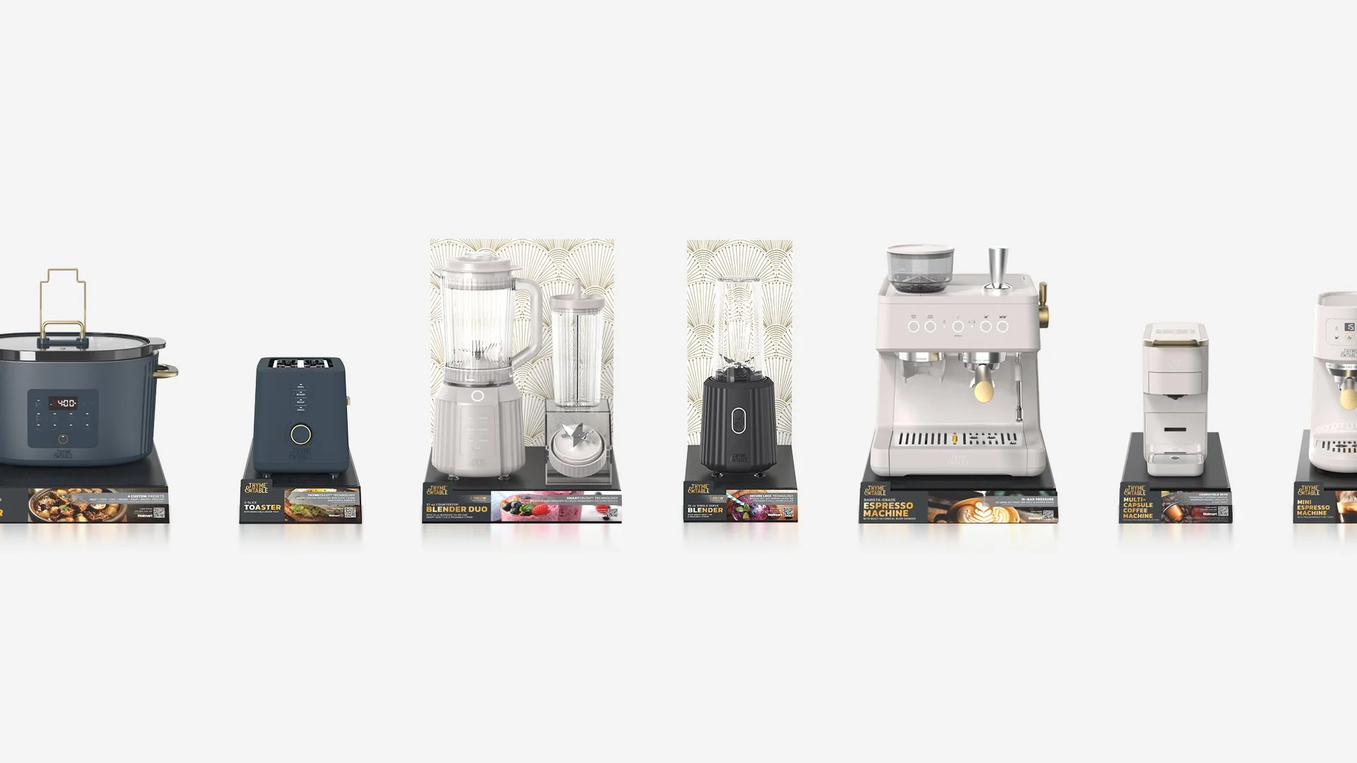
This project introduced the first kitchen appliance packaging for Thyme&Table™, a brand known for its bold, elevated look across cookware, utensils, and dinnerware. The challenge: bring the brand into the more tech-forward appliance space without losing its premium, fashion-forward appeal.
The solution was a two-part packaging system designed to be both visually striking and physically engaging—blending high-end aesthetics with a purposeful unboxing experience, available in Walmart stores and online.
Brand:
Thyme&Table™
Retail Placement:
Walmart (in-store & online)


My Role
I led the overall packaging concept development, building a visual and structural system that evolved the Thyme&Table™ identity to suit the appliance category. The goal was to keep what made the brand distinct—black and gold tones, lifestyle-led visuals, and foil accents—while introducing a bolder, more modern edge suited for electronics.
This Included:
Leading the creative direction for both outer and inner box designs
Defining layout hierarchy, typography usage, and gold foil placement
Collaborating closely with the industrial design team on 3D renders (credited to them)
Refining the final output with input from peers across design fields

Design Direction
This packaging system builds on Thyme&Table’s signature black and gold aesthetic, reimagined for the appliance category. The design replaces traditional serif typography with a modern sans serif to align with the tech-forward space, while full-bleed product renders and schematic-inspired graphic elements add structure and clarity. Gold foil remains as a subtle premium accent, and strategic white space gives the layout room to breathe. The result is a bold yet refined system that feels true to the brand.
Packaging Structure & Experience
To elevate the perception of the product and the moment of unboxing, the packaging was developed as a two-part system:
The outer box is made of thin corrugated cardboard and features full-color artwork, gold foil accents, and the brand’s black-and-gold aesthetic.
Inside is a thicker corrugated inner box, printed in tech-inspired black-ink-only artwork for a dramatic contrast.
The act of pulling the inner box from the outer sleeve is designed to evoke a premium, Apple-like unboxing experience—complete with a subtle suction or “vacuum” effect. As the inner box slides out, the black-on-black technical illustrations are revealed, creating a layered sense of discovery and intentionality.
This tactile detail reinforces the brand’s elevated feel and creates a memorable first impression that goes beyond shelf appeal.

This packaging concept allowed Thyme&Table™ to confidently enter a new product category while preserving the brand's design language. It bridges fashion, function, and form & creates a system that works in-store & online. It also laid the foundation for how the brand can continue expanding into lifestyle electronics while staying rooted in its elevated kitchen identity.
Outcome


